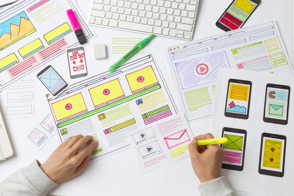
A website is the new business card. It is the first thing that people will see when they want to see the products or services that you offer. A good-looking website with an easy-to-understand GUI is one of the few things that can increase your customer retention and follow-through for sales.
This will help you get more people into your sales funnel, and you will also have a higher chance of a conversion. In this day and age, a website serves a much larger purpose than you think.
So here are a few mistakes to avoid –
1. Disruptive pop-ups
Many users find popups unnecessary, and they often obstruct the view too. You might want to put a pop-up for the upcoming sale, but it hampers the user experience in the long run. Not only that, but it also will make you rank lower now.
Google now factors in website loading times and how their UI for better rankings, and if you have been doing pop-ups, it is now time to stop. Older people also think of pop-up ads as malware. If they are not optimized for mobile, they can make your website worse too.
2. Auto-playing videos with sound
A video is the best way of marketing and gets your point across very well. But this is only true if people want to hear you and have a fast internet connection. An auto-playing video on your website’s front page can be a dealbreaker for many.
Most people do not like to be greeted with a video that is taking away their precious data and slowing loading times. On top of that, loud audio can disturb their quiet web-surfing experience too.
3. Navigation Issues
There should be clear marking for where one can clock and how they can find the info that they need. Everything must be laid out in a logical format that is easy to understand too.
With reduced attention spans, people want to get to what they want earlier than ever. If they cannot figure this out on your website, they will leave it immediately for something else. This is why your pages must link together properly, and they should load fast too.
4. Non-Responsive Design
A non-responsive design means that the website does not adapt to the device on which it is being viewed. There is a difference when you design a website for a desktop as compared to one for mobile.
Your website should be able to adapt for every device and also have the necessary sizes for each website. Doing this will ensure that your website gives you the best result every time. NJ Web Design Company makes sure that your website is responsive and looks great on any device.
5. Content that can’t be scanned
If there is a wall of text, as soon as someone visits it, then there is a high probability that people will leave it too. The person reads the text on the screen slower than they read in a book. Plus, with a website, you will have to add emphasis on how the text is presented too.
Photos, animations, and hyperlinks can be distractions too. If someone wants to read up on your product or service and then get a wall of text, the chances of them leaving gets higher.

6. Loading Times
Google, in its updates, has said that they will be factoring in Loading times when ranking the websites. This means that your website will have to load on any device faster than the competitors.
A compressed image is needed on your website, or it will slow down loading times. With that, also check the sizes of the images that you are uploading. If they are large, then there can be problems when you load your website.
7. Typography
Not only should the text on the website be error-free, but it should also be in a font and hue that is easy to read. The less straining the text is, the longer your audience can stay and read it.
If the text is hard to read, then people will lose interest in what you are trying to say and leave. Clean and clear fonts with consistency are the way to go. Make sure you have no more than three fonts on your website
8. Visual Content
Graphics are everything in today’s day and age. If you have been planning to upgrade or make a new website from scratch, make sure you have enough graphic content. It should be easy on the eye.
9. Contact Information
How you can be contacted should be clearly visible and easy to find on your website. This can be regarding issues with the service or product or even general inquiries. Having clear information out front will help you get more customers in the long run.
10. Links
Links that open to another tab or window ruin the UX for the people visiting your website. These can be accidental clicks or someone just clicking something out of curiosity. In the end, it leads to a bad user experience and you losing business.
11. SSL
Cybersecurity has been a major cause of concern in the last five years or so. Secured websites are now preferred by Google and will rank them higher. With SSL being implemented on most new websites, it is imperative that you do the same too. Protecting your customer’s data is your responsibility, and you can do that by implementing a few cyber security measures.
12. Search functionality
If you offer a search bar functionality on your website, then make sure that the new blogs/services that you are offering can be found through that. Many times people type in what they are looking for, but that does not show up in the results.
The visitors should be able to find any and all of the information they need as fast as possible. Focusing on the aforementioned few things can help you take your UI/UX to the next level.


