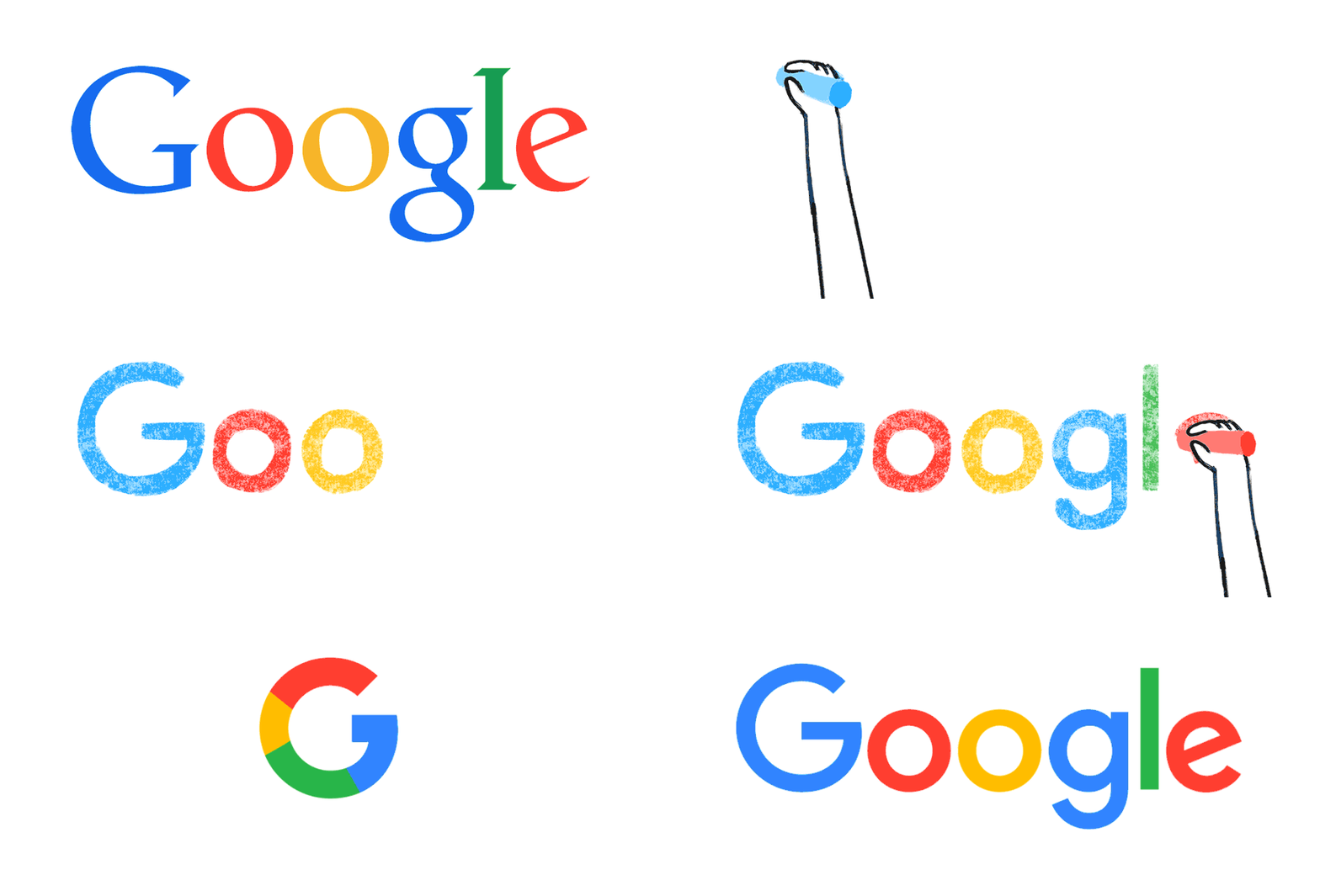
Today, 1 September 2015 is the day when Google redesigned its logo. The New Logo looks simple and its major design change after almost a decade. Notably, Google retained all colors of its original logo. New Logo is based on serif wordmark with little tweaking in spacing and removed drop shadow. The new logo is in line with its parent company Alphabet.

These changes will reflect on all its product across all the platforms. The new logo is designed in such a way that it can be used in multi purpose way. While Google searches for your query it will show you animated 4 dots waving and when the results gets displayed Google logo will be revealed. (See the animation above)
The new logo is simple yet powerful. You can get a lesson for your life from google. It reminds me of simplicity. greatness comes from simplicity.
Past Google Logos
- Original Logo (September 1998 – October 1998)

This is original logo. It was used briefly, just for two months.
2. October 1998 – May 1999

This logo has exclamatory mark at the end. Similar to Yahoo!
3. May 1999 – May 2010

This logo was simplified and was used for more than a decade. Google grow faster in these periods and became a giant company worldwide. May be they had other important things to focus rather then on logo.
4. May 2010 – September 2013

The logo was further simplified and shadows were removed from wordmark.
4. September 2013 – August 2015

Ruth Kedar designed logo were introduced two years ago in September 2013.
Apart from these logos, G also has colorless logos and Doodles that change daily.
“Nothing is permanent but change.”
Google was founded by Larry Page and Sergey Brin in their college days when they were pursuing Ph.D. in Stanford University. In January 1996 Larry and Sergey were working on a research project and Google was born. Before Google the internet was based on web directories and there were no words like search engine marketing, PPC, SEO etc. After G, the world has changed drastically and almost every company’s success depends on Google marketing.
–


